Data Visualizations
The following exploratory data visualizations are built off of our transcription methodology and data API. Use the category filters below to explore different types of analysis, or view all visualizations at once. Each visualization is interactive and built from our transcribed historical data.
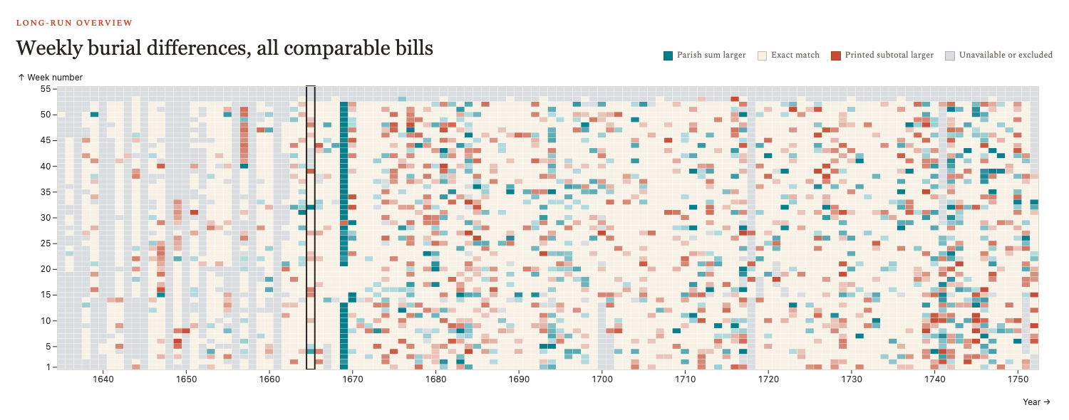
Arithmetic Accuracy
Compare printed weekly subtotals with parish-summed mortality counts

Calendar of Causes
Graphing the causes of death over time
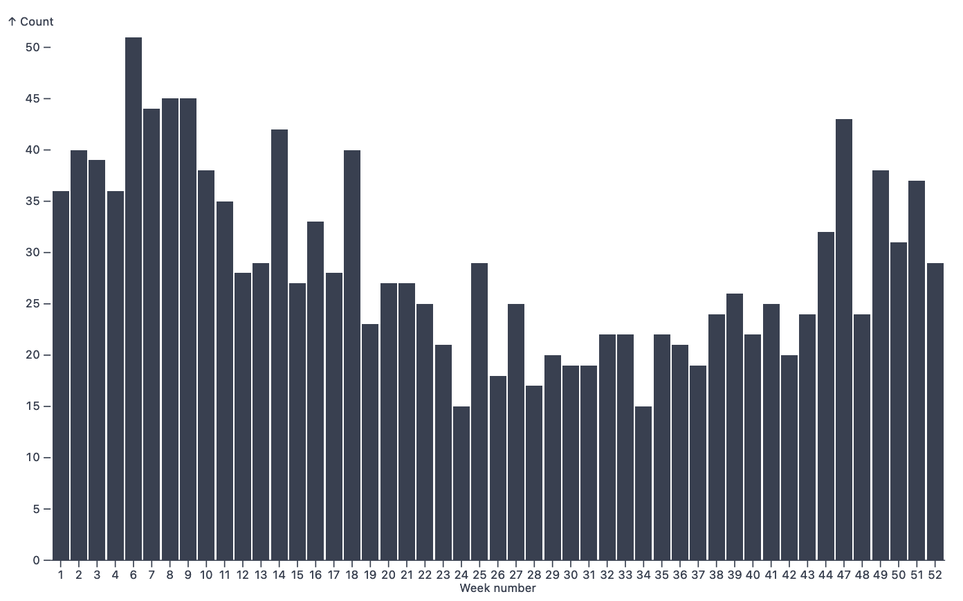
Causes Histograms
Graphing the causes of death per week
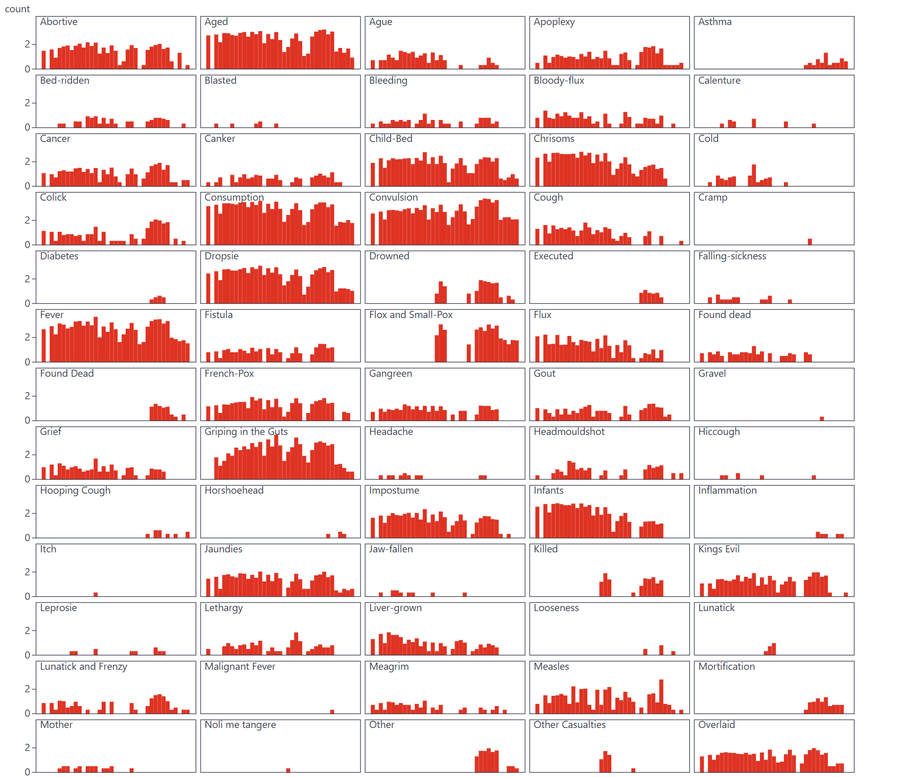
Causes of Death (General Bills)
Sparklines of Causes of Deaths from General Bills
Causes of Death (Weekly Bills)
Sparklines of Causes of Deaths from Weekly Bills
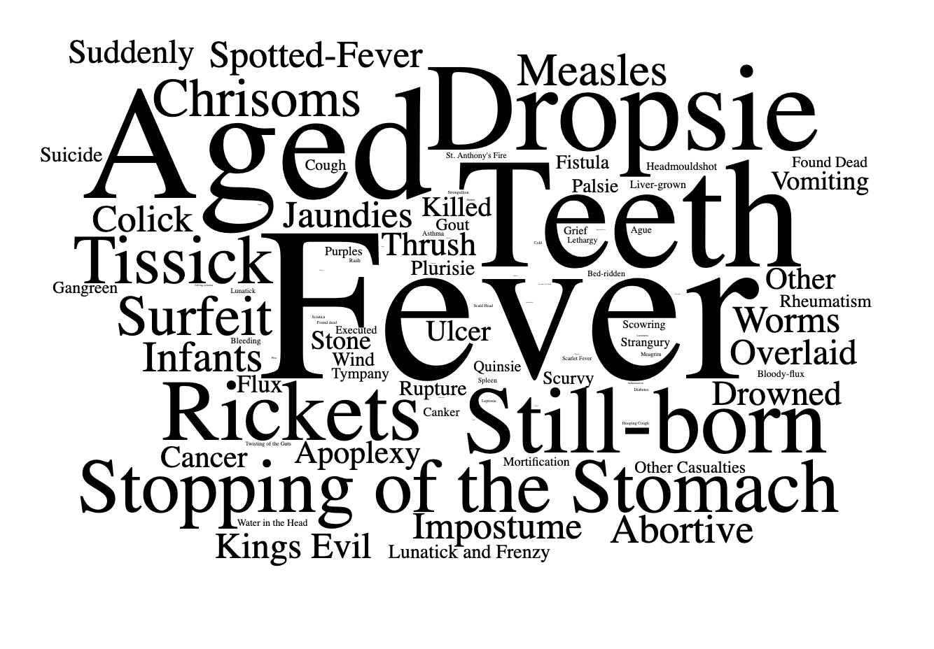
Causes of Death as a Cloud
Charting the causes of death
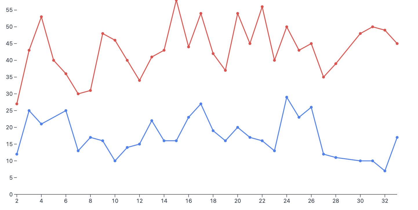
Causes Seasonality
Visualizing the seasonality of causes of death
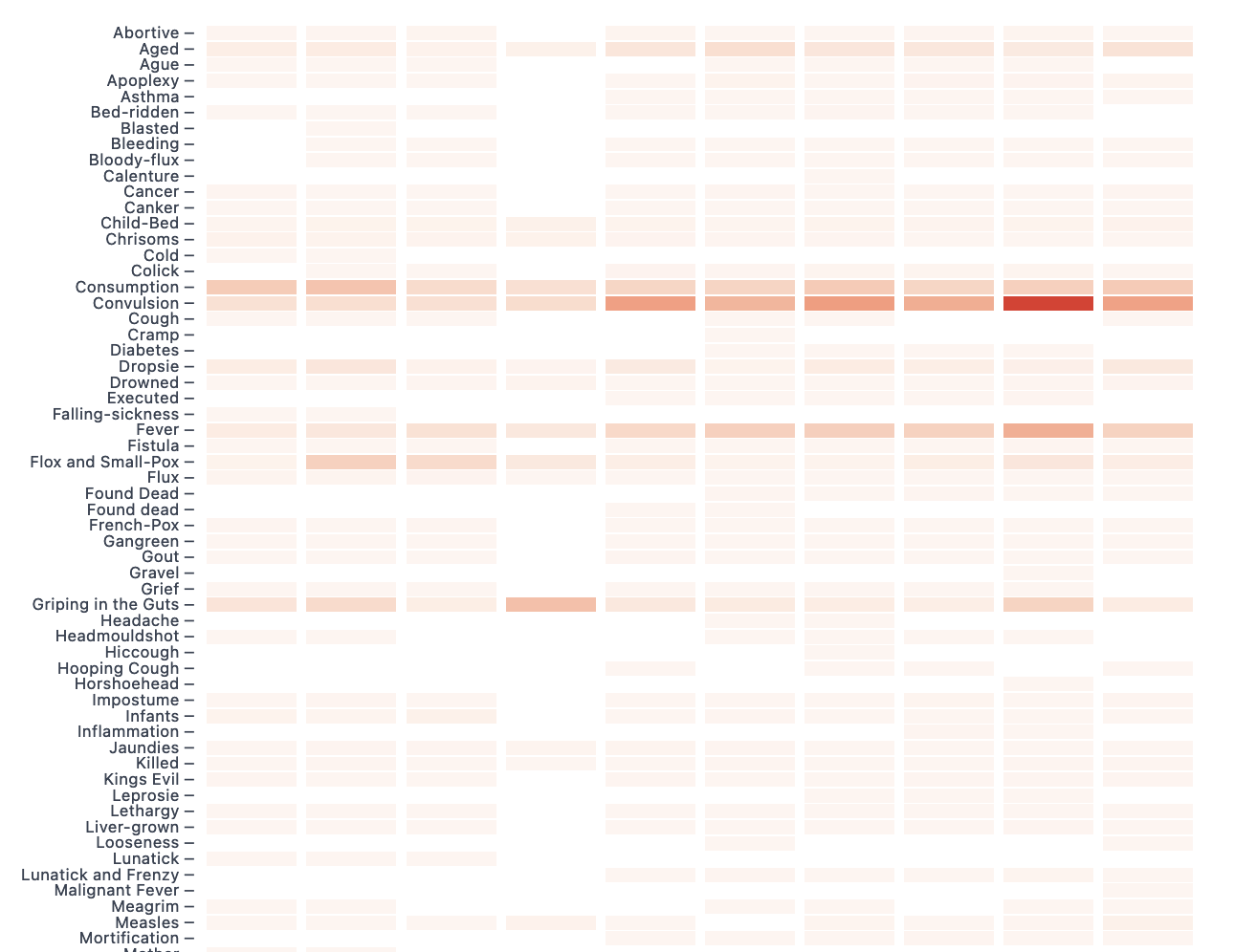
Counting the Causes of Death (General Bills)
Charting the causes of death from general bills
Counting the Causes of Death (Weekly Bills)
Charting the causes of death from weekly bills
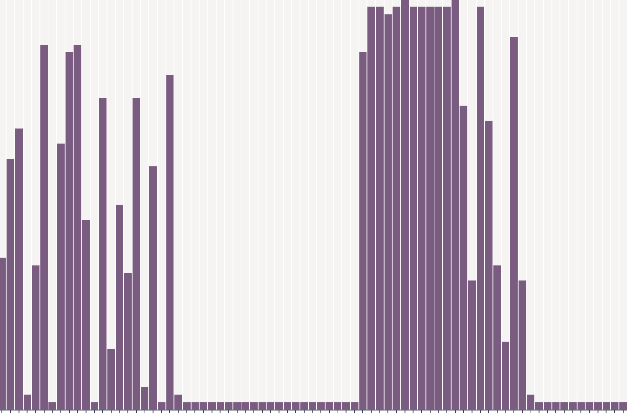
Counting the Transcribed Bills
Charting the completeness of our transcriptions
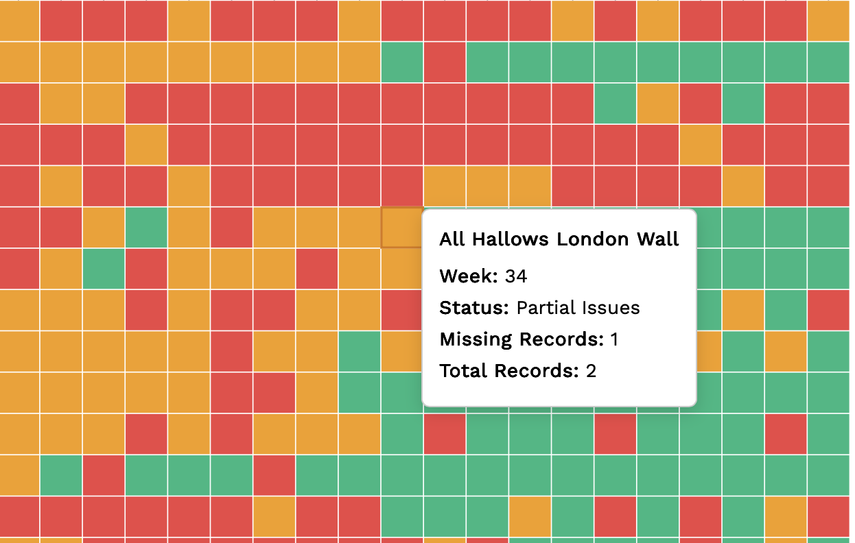
Data Quality Analysis
Visualizing data quality and illegibility patterns over time
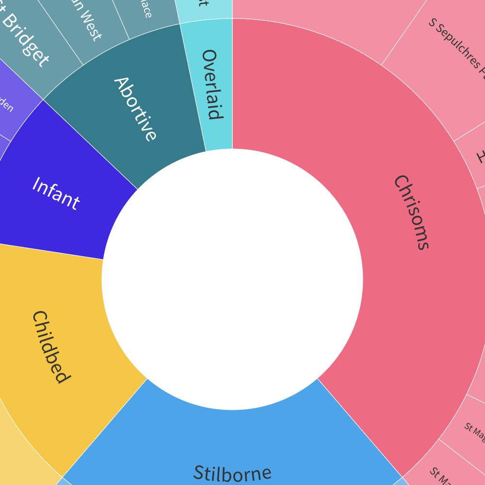
Infant and Maternal Mortality in the London Monarchical Bills 1665-1669
Visualizing infant and maternal mortality in the monarchical bills.
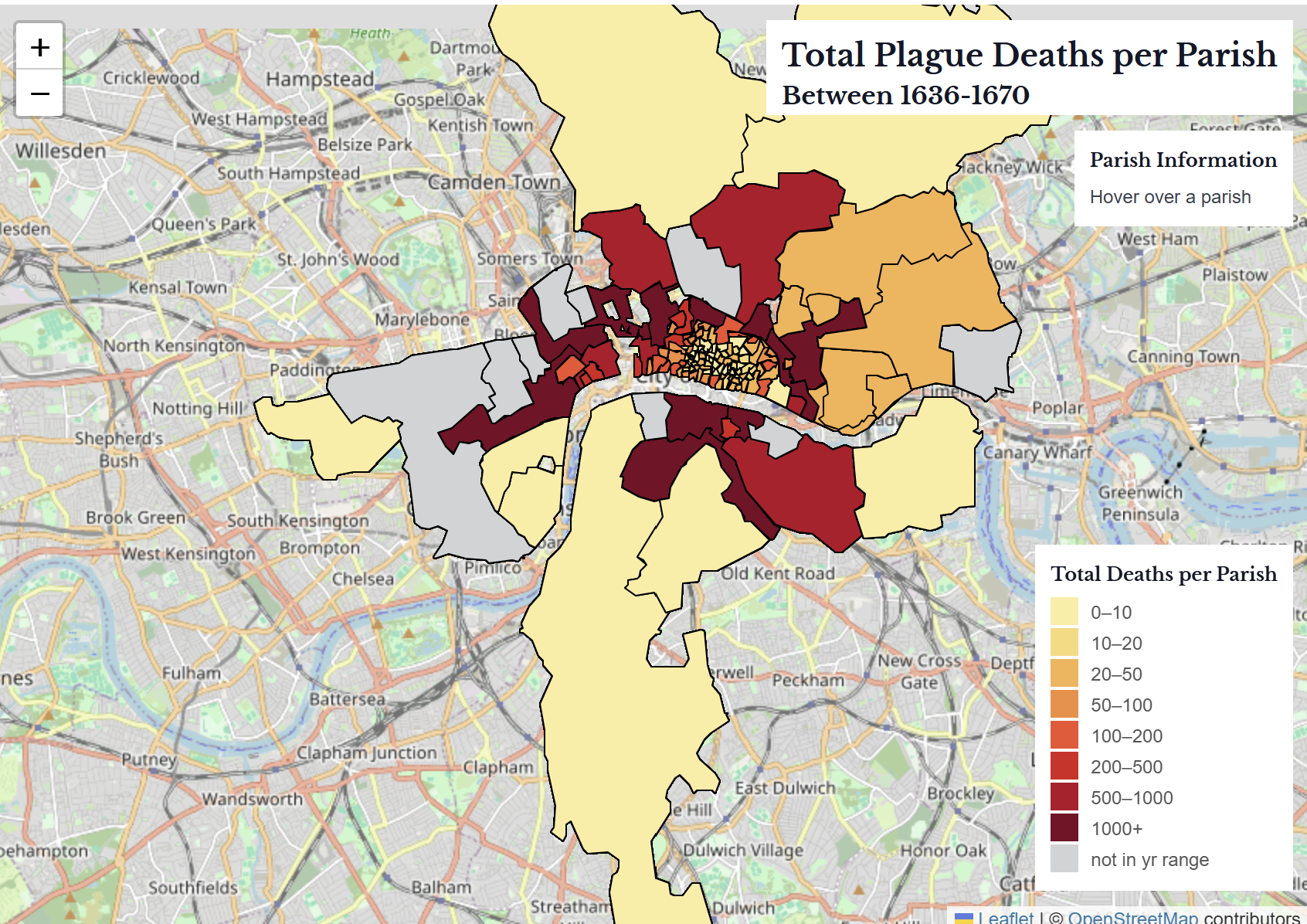
Mapping Burials and Plague
Mapping plague and non-plague deaths
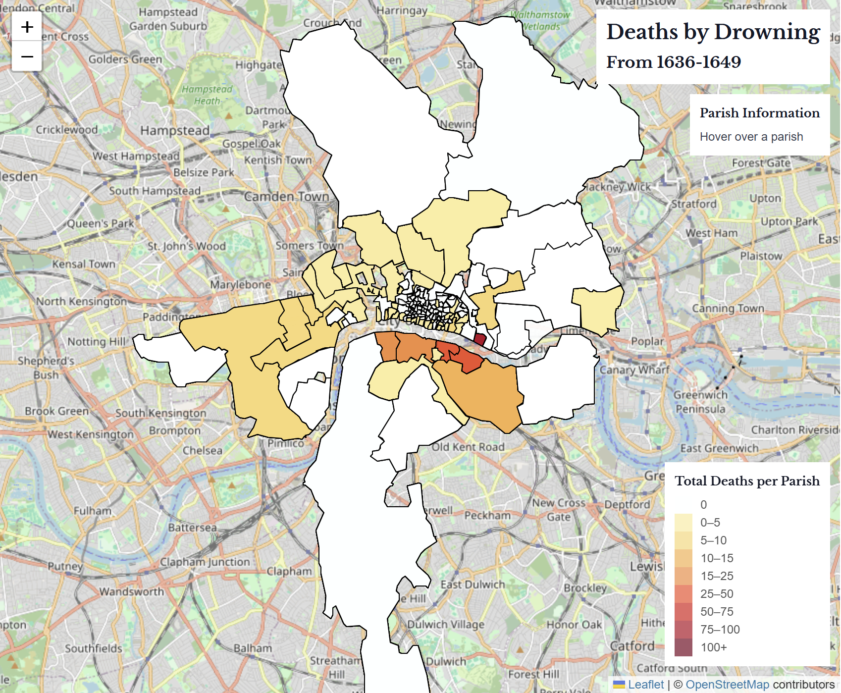
Mapping Suicides, Drownings, and Killings in the Bills of Mortality
Mapping text analysis on suicides, drownings, and killings in the Bills of Mortality.
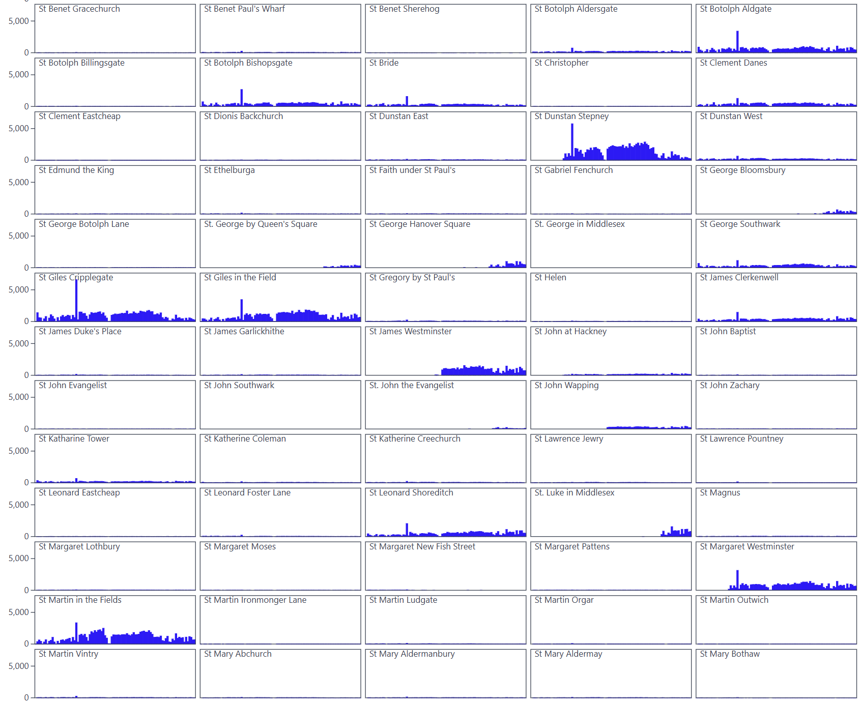
Parish Deaths
Sparklines of plague and non-plague parish deaths
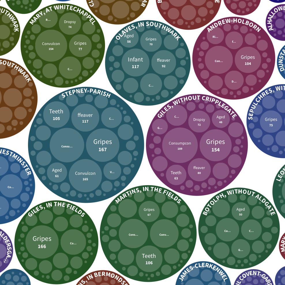
The Monarchical Bills of Mortality, 1665-1669
Visualizing the causes of death by parish in the monarchical bills.